Warm Modern Southwestern Interior Design: A Complete Guide
The light is strong in Arizona. The landscape is layered but quiet. And the homes that work best don’t fight that, they lean into it.
My warm modern Southwestern design isn’t about creating a “look.” It’s about creating a home that actually feels good to live in, especially here in the desert.
It should work for you and not against you. The goal isn’t to design something impressive for a photo. It’s to create a space that feels grounded, calm and easy to live in every day.
While this guide focuses on Southwestern design, most homes blend multiple influences. → “How I Help Clients Define Their Design Style”
What Makes It Feel Modern (Not Themed)
Traditional Southwestern design tends to be more expressive: color, pattern and recognizable details.
My approach to this style is more restrained.
You still see the influence but it shows up in quieter ways:
- authentic materials
- simpler forms
- more attention to proportion and light
Nothing feels overly styled. And that’s exactly why it works.
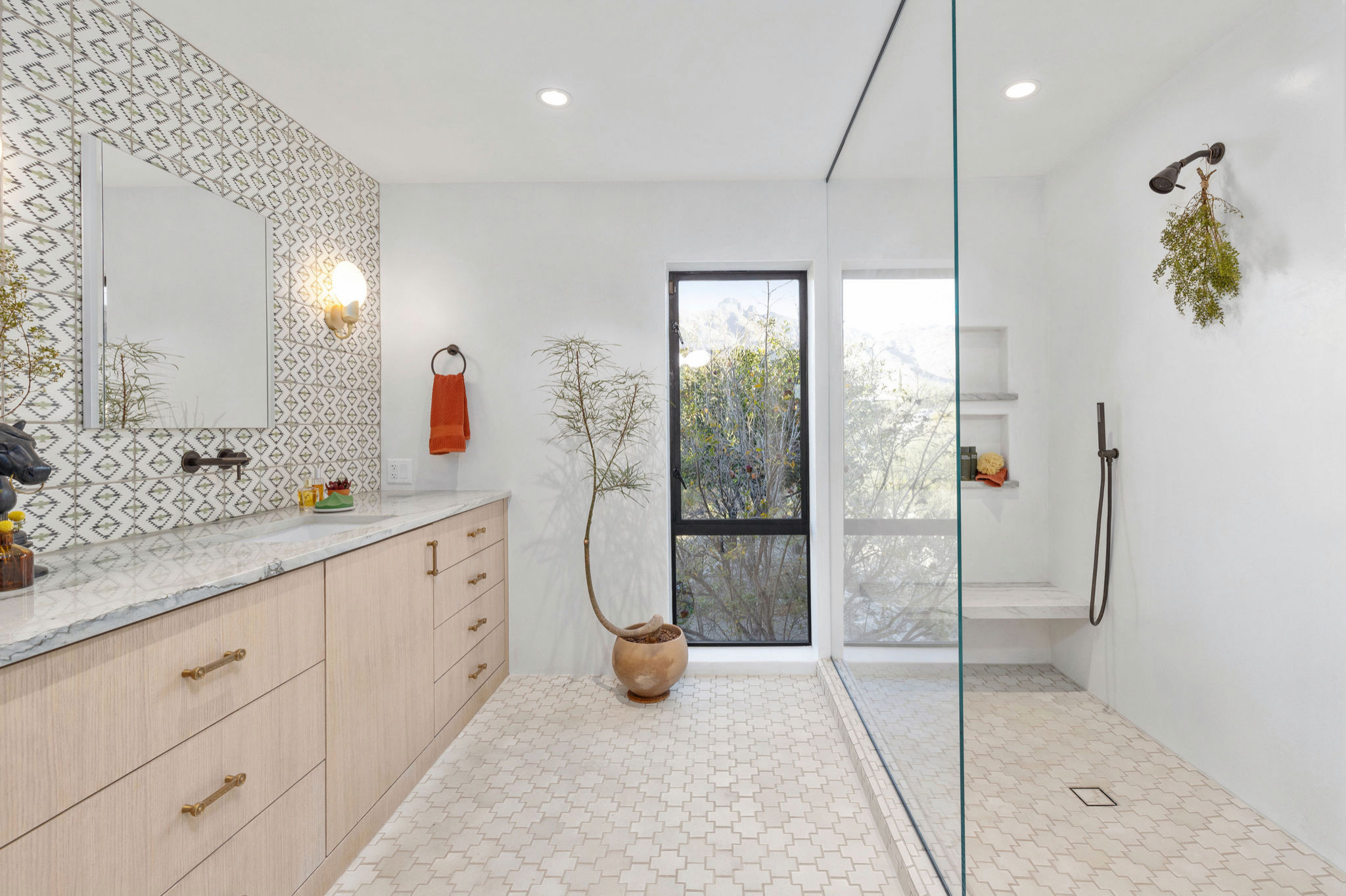
Materials Matter More Than Anything Else
This is where I always start. Because if the materials are right, the space will feel intentional. If they’re off, you’ll keep trying to fix it with more “stuff.”
What consistently works:
- plaster with subtle movement (not perfectly smooth)
- wood that feels natural and a little worn in, not glossy
- stone with variation and depth
- handmade tile that isn’t trying to be perfect
- leather and textiles that age gracefully
I’m always drawn to materials that show a bit of life: patina, variation and imperfection. That’s what keeps a home from feeling flat. Authentic materials always read better and they hold up over time.
Color Should Support the Space, Not Compete With It
Most of the palette comes straight from the landscape, but softened.
- warm whites
- sand and clay tones
- muted greens and sky blue
- deeper browns and charcoal
It’s layered rather than high-contrast. When it’s working, you don’t walk in and think about the color. You just feel that the space is calm and balanced.
Architecture Should Do Some of the Work
One of the biggest missed opportunities I see is ignoring the architecture. Even simple changes make a difference:
- soft arches instead of hard openings
- deeper window returns
- wood lintels with some presence
- fireplaces that are simple and integrated
You don’t need a lot of decoration when the structure already has weight to it.
Texture Is What Makes Neutral Spaces Interesting
Without texture, this style falls flat quickly. Instead of relying on pattern, it’s about contrast in materials:
- smooth plaster next to wood grain
- stone against linen
- leather layered with woven textiles
It’s subtle but it’s what gives the space soul you can feel.
Furniture: This Is Where Restraint Really Shows
Most people try to do too much here. You don’t need a lot, you need the right pieces:
- clean-lined, but with some visual weight
- warm wood tones
- neutral upholstery
- a few pieces that feel considered or custom
- mixing in vintage or antique items
The space should feel intentional, not filled.
Lighting Can Make It or Break It
I see this go wrong all the time. If the lighting is too harsh or too decorative, it immediately pulls the space away from that calm and grounded feeling. What works better:
- plaster or ceramic fixtures
- aged brass or simple iron
- linen shades
- layered light instead of one main source
You can’t ignore task lighting. However at night, the house should feel warm and quiet—not like an operating room. And install dimmer switches absolutely everywhere!
Kitchens Should Feel Like They Belong
Not like they were designed separately. The ones that feel the best are functional, simple and integrated:
- cabinetry without a lot of detailing
- plaster and sconce lighting
- stone (or quartz that reads natural)
- tile used intentionally, not everywhere
I come back to natural, off-black countertops with wood often—they create contrast, but still feel grounded.
The Indoor-Outdoor Connection Isn’t Optional
Even in a smaller home there should be a relationship to the outside. That might mean:
- larger openings in windows or sliding doors
- a simple patio or courtyard
- materials that carry through
It doesn’t have to be dramatic but sight lines matter. How you move through the space and how it connects to the outside must be considered.
Where Things Usually Go Off Track
It’s almost always “too much.”
Too many materials. Too many accents. Too many obvious “Southwestern” elements.
The better approach is to edit. Stop a little earlier than feels comfortable. That’s usually where the space starts to feel its best.
→ “How I Help Clients Define Their Design Style”
Why This Works So Well in Arizona
This style isn’t just aesthetic; it actually responds to how we live here.
- materials that hold up in our unique climate
- colors that soften intense sunlight
- spaces that feel cooler and quieter than the exterior
When everything is working together, the house feels like it belongs here.
Working With a Designer
This kind of space looks simple, but it’s not. A lot of the impact comes from decisions that aren’t obvious:
- how materials transition
- how things are scaled
- knowing when to stop
That’s where experience really matters. My recent client’s attitude changed from “I don’t want to ever be in my kitchen!” to “ My family and I never want to leave the kitchen now. And I am rediscovering my love of baking.”
My role is to guide you through those decisions so the end result feels like your home. Just more refined, more cohesive and easier to live in.
FAQs
What colors work best?
Warm, layered neutrals. I don’t limit neutrals to 1,000 tones of beige. If you can find the color in Mother Nature, it can function as a neutral. If it feels high-contrast, it’s usually too much.
Does this style have to feel rustic?
No. It can be very clean and modern—it’s more about restraint than specific style labels.
What materials matter most?
Plaster, wood and stone. Get those right first.
Can this work in a newer home?
Yes—but it often needs a bit more architectural detail to avoid feeling flat. You can also introduce that sense of depth through well-scaled furnishings and materials.
How do you keep it from feeling themed?
Focus on materials and proportion. Skip the obvious motifs.